
Site Refresh
A few weeks ago we intro’ed a fresh coat of paint on the Cotton Bureau home page. Here’s what you need to know:
Hero Cards
Remember that mangy, old hero area we had? Said something like, “Say hello to Cotton Bureau. The curated, crowd-funded t-shirt community for designers.”
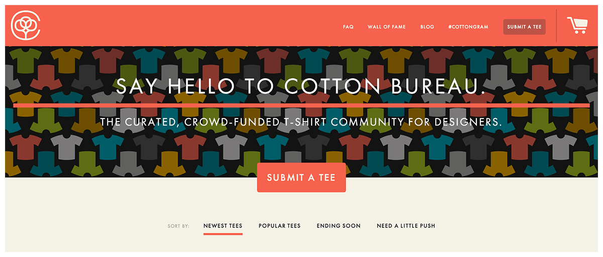
Well, that’s all still true, but it was time for a change. Introducing the new and improved hero area:
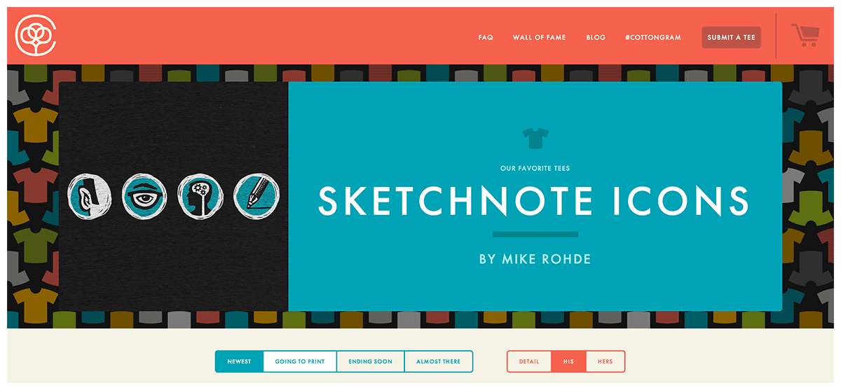
For most people arriving at the home page, the hero area is going to be the first place their precious little eyes alight. We happily used it for the last nine months to introduce ourselves and suggest that, if you hadn’t already, you really ought to send us something. (No, seriously, send us something.) Well, we’re all growed up now, and want to use that space to highlight a few of our favorite shirts each week. Is your design a cut above? Is it streets ahead? You might just find yourself featured on the home page.*
*Applies only to large screen home pages. These kinds of shenanigans don’t belong on your mobile device.
Color
With your keen, Holmes-ian sense of observation, you might have additionally noticed: color. The ol’ Cotton Bureau color palette has been quite limited since the launch. With the exception of the t-shirt background grid, it’s been a steady diet of red, slightly different red, a little green, and a lot of neutral. Time to mix it up a bit.

The new (to you, at least) colors take center stage as big blocks in the hero area and major role players in the tagging feature that we’re going to talk about right… now.
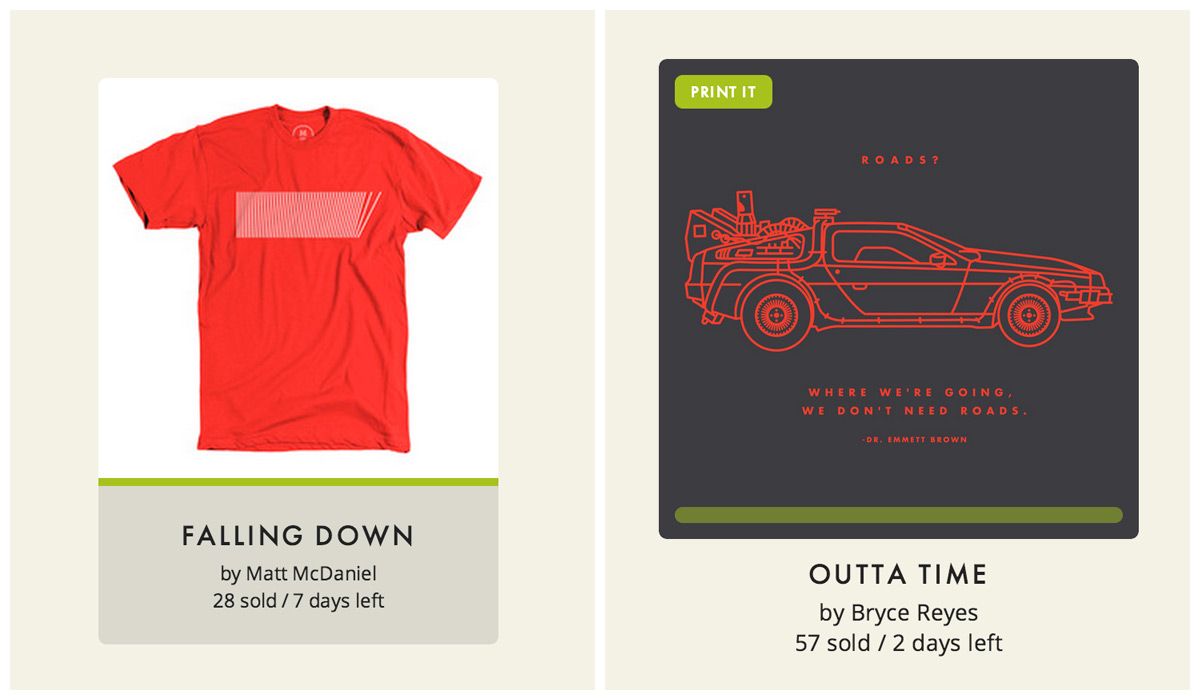
Sorting & Tagging
Sorting isn’t a new Cotton Bureau feature, but we did tweak the style to stand up to the chunkier home page layout. (And you might just find a very “colorful” Easter egg if you give it a try.) We also included a view toggle, so you can see our new detail view (more on that below), men's mockup, or women's mockup right on the homepage.
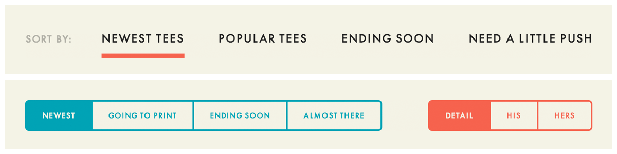
Top, old; bottom, new.
The concept and implementation of tags came out of a desire to de-emphasize the progress meters without losing the benefit of showing which shirts were close to being funded. As long as we were tagging funded shirts, we figured, why not also show which shirts were new, which ones were ending soon, and which ones you could go ahead and order without worrying if it was going to make it.
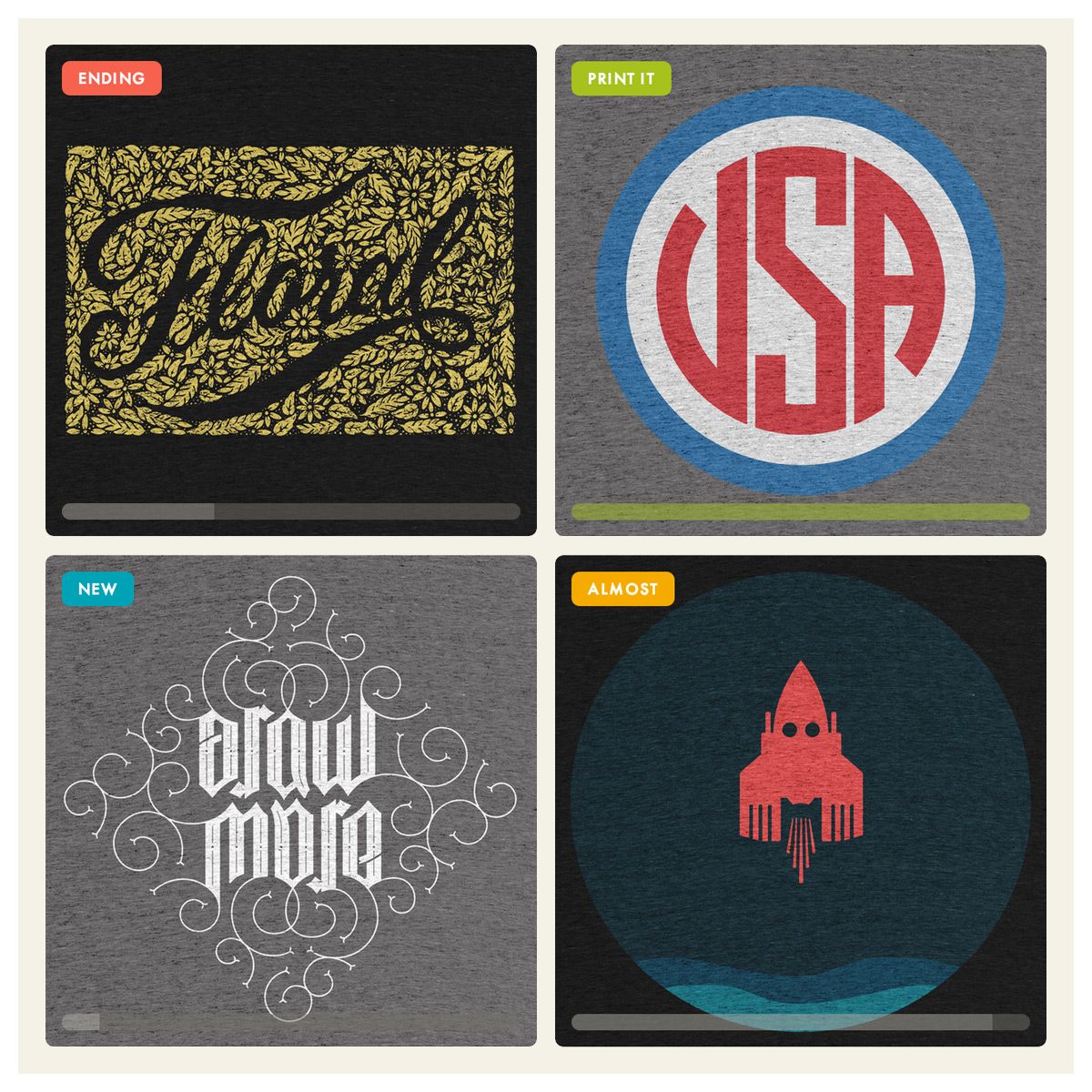
Having tried a number of styles (hollow? ribbons? monochromatic? icons?), we think the current execution is prett-y nice. We hope they help you out as you work your way around the home page.
Detail View
Possibly the most substantial and eye-catching change of the new home page is the switch from t-shirt mockups to zoomed-in detail views.
Left, old and tired; right, fresh and new.
Showing t-shirt mockups made a lot of sense when Cotton Bureau was brand new. Being explicit at the expense of being convenient is always smart when you’re targeting new users. As we grow, however, the pain of not being able to see some of the more sophisticated designs is frustrating for repeat users of the site. We want to place the emphasis on the artwork, not the silhouette of the shirt.
Coda
Full disclosure: we have no idea if these changes are going to sell more shirts. What we can say is that they feel right, and that we’re going to do our best to learn how to test these changes so we can give everyone the most efficient and enjoyable experience possible.
This is fun, right? We’re learning and hopefully you are too. If you’d like to come along for the ride, follow us on Twitter, subscribe to the blog RSS feed), or sign up for our weekly newsletter.