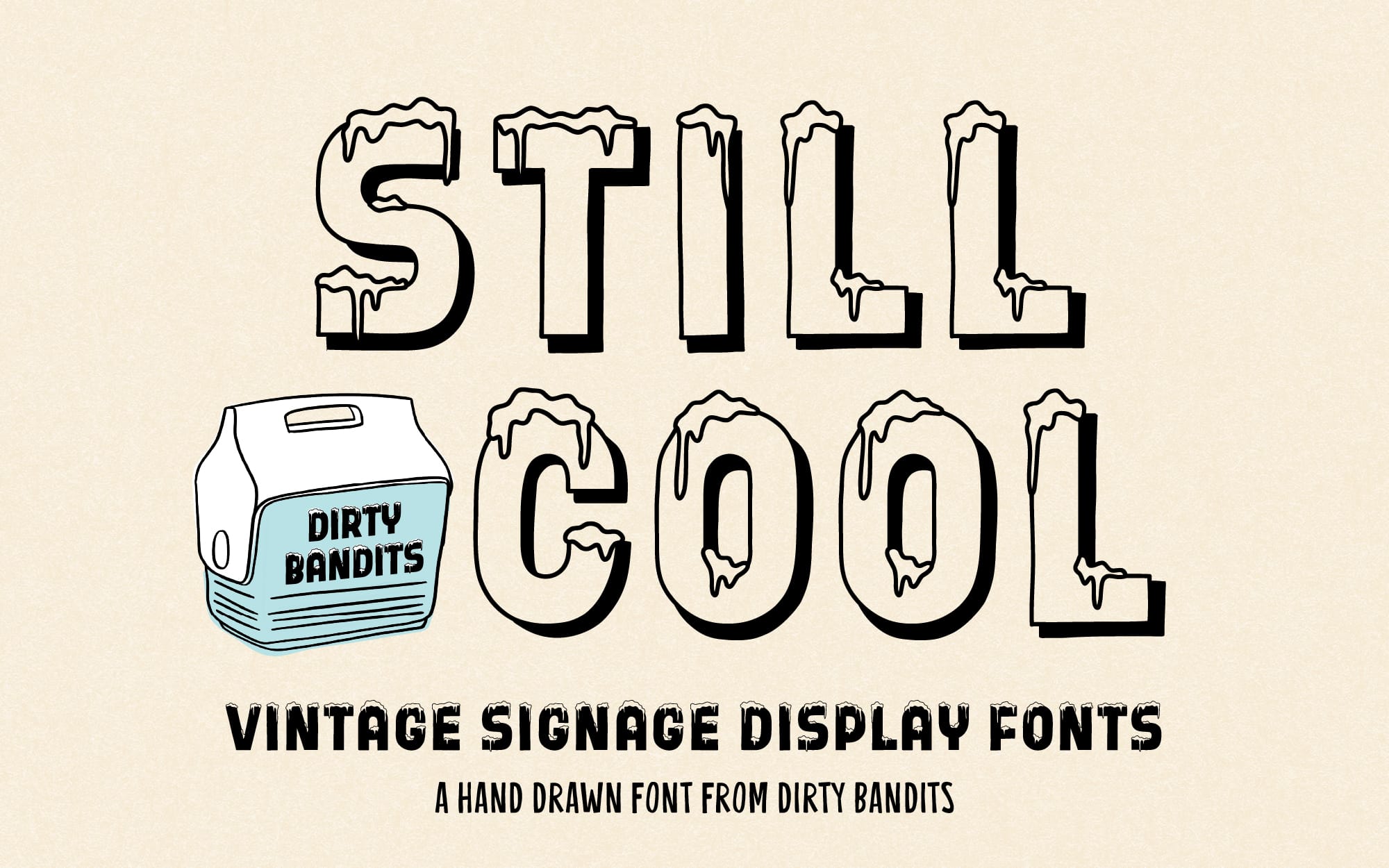
It’s a scorcher out there. Stay cool with these fun links.
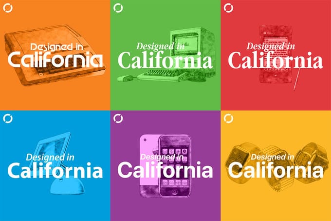
Designed in California
Very good friends of Cotton Bureau Jason Snell and Myke Hurley are producing a 50 episode podcast series on the history of Apple product design to celebrate the company’s 50th anniversary. The project is already more than 5X funded, locking in live shows in San Francisco and London. It’s not too late to support, though time is running out. Campaign ends Wednesday, July 1 at noon Eastern.
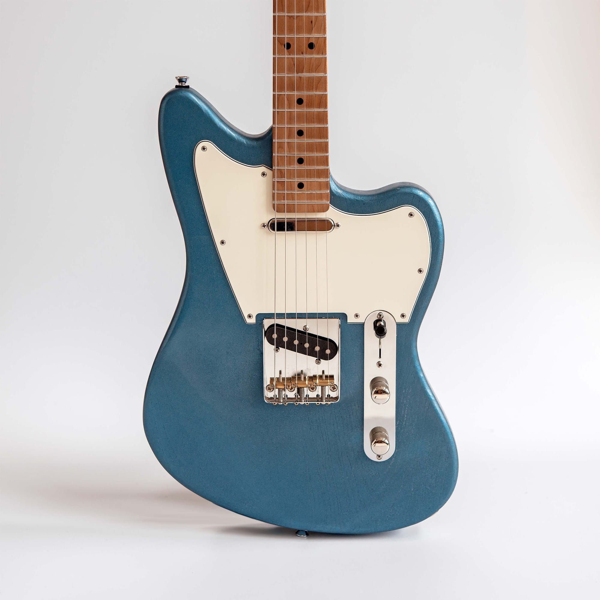
Our good friend Dan Povost (of Studio Neat) spent so much time modding his electric guitar he decided it would be easier to just build his own. If you need a custom guitar, he’ll build one for you too.
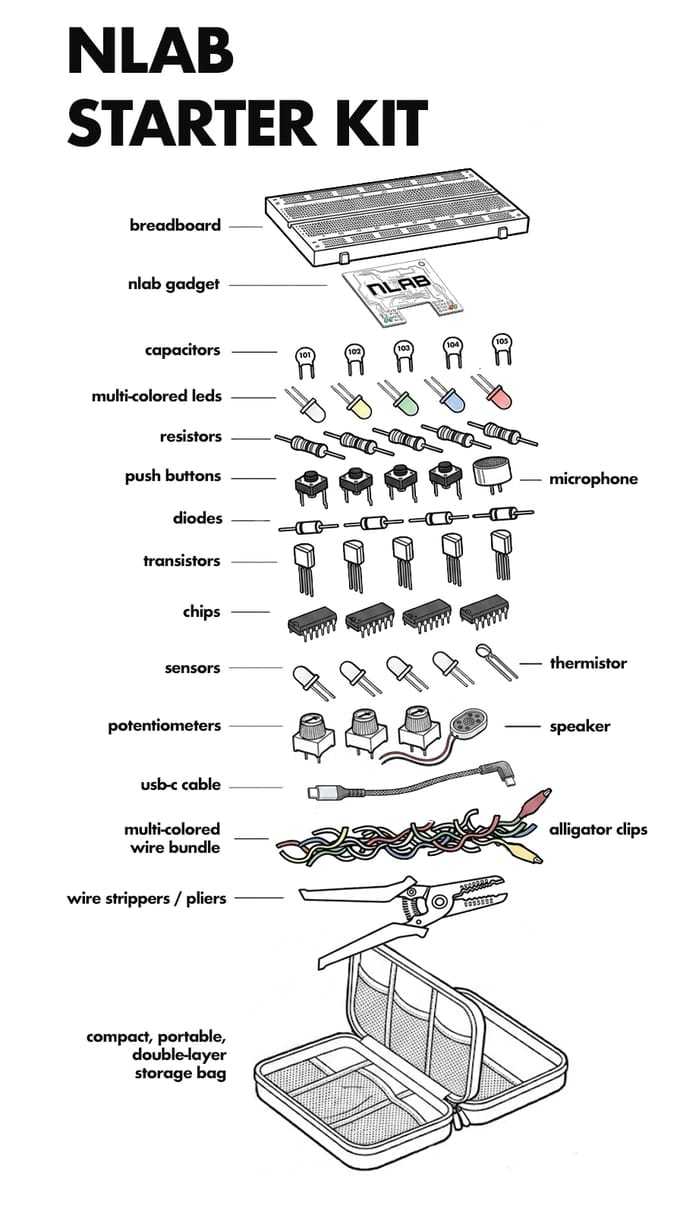
Back in Kickstarter land, you have less than 72 hours to support nLab and get “the world’s smallest all-in-one electronics lab”. For $179 you (or maybe a recent high school graduate entering an engineering program in the fall) get everything you need to start learning how to harness the power of electricity.
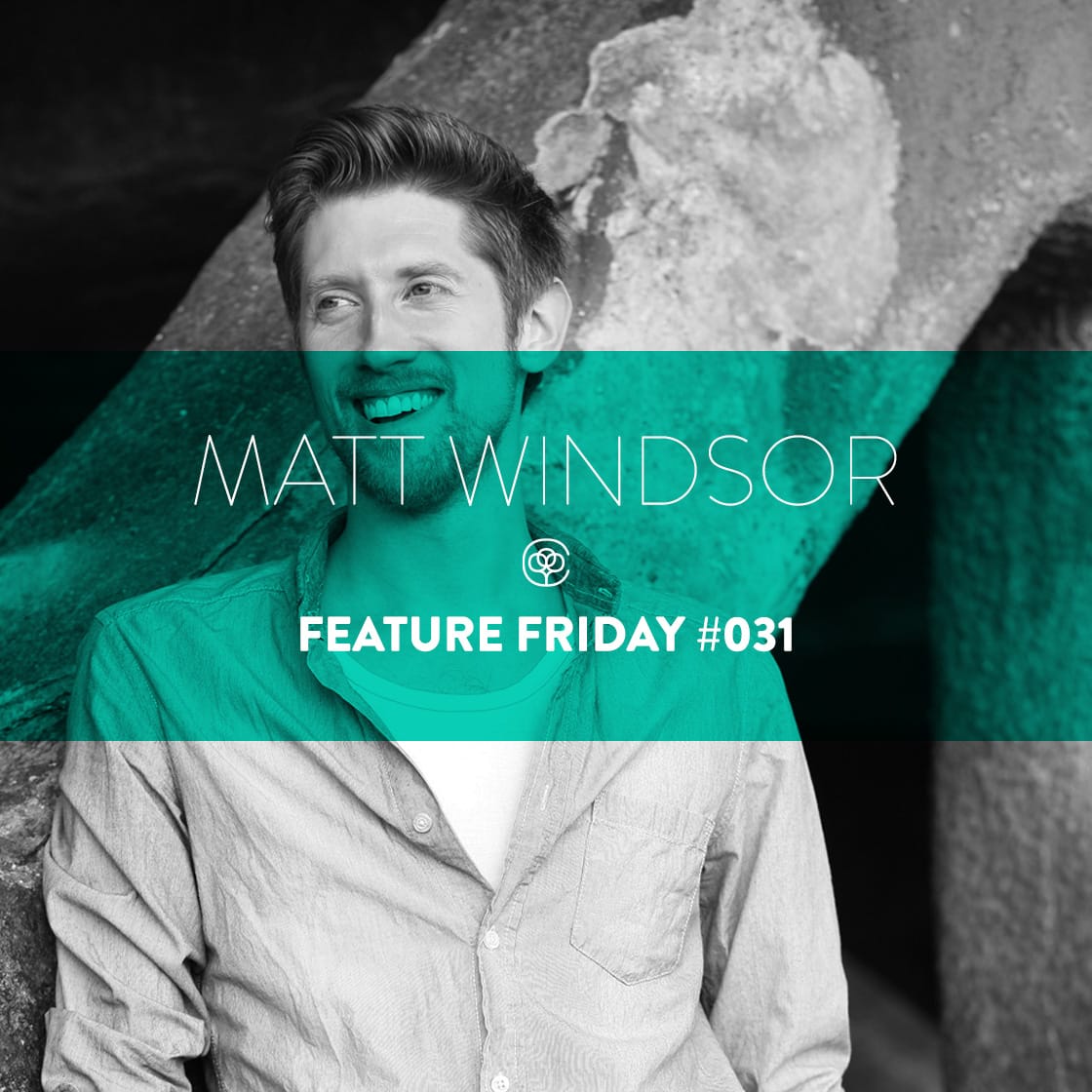
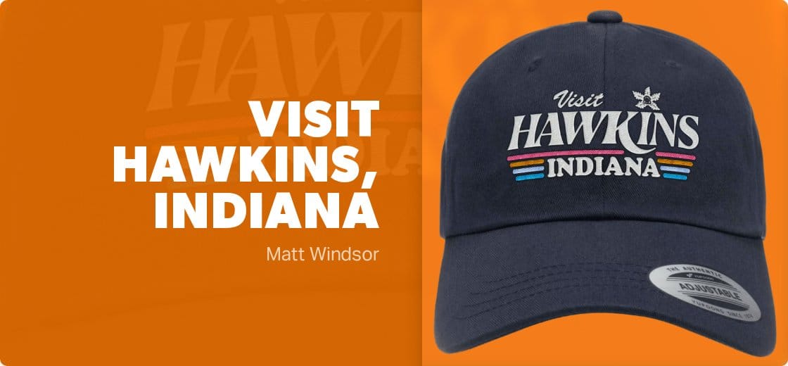
Catching up with Matt we learned in addition to his design career he may just have a future in Hollywood? Warning: intense popcorn cravings and Stranger Things spoilers ahead.
Matt! Hi! Welcome to Cotton Bureau’s Designer Interview Series. Let’s start with the basics. How have you been? Where have you been? What’s your life looking like lately?
Hi there! Thanks for having me! At the moment I'm going through one of those busy periods, which can happen with freelancing, where everything seems to come in at once. That combined with the multiple feet of snow currently covering my Cape Breton home, has meant I haven't been going to too many places recently. Although I feel like I’ve been traveling very far and wide through the book I'm currently designing — it’s all to do with NASA and the history of space exploration — and I’ve been enjoying nerding out on all the cool picture research.
How life’s treating you?
Okay okay busy is stressful I’m sure but also a good problem to have as a freelancer. Plus, if you’re stuck at home anyways ¯\(ツ)/¯ Cape Breton is probably incredible though, eh 🇨🇦? I would be super antsy if I was trapped at home knowing all that adventure is right outside my door.
A NASA book sounds like fun, I bet you’re learning all kind of interesting tidbits. Have you made your way over to thanking my lucky stars this interview is being conducted via email so I don't have to butcher this nameKejimkujik National Park? As a Dark-Sky Preserve I feel like a visit would qualify as research. Maybe on a clear night you’ll be able to see some astronauts floating around up there ;)
I definitely prefer to be busy than doing nothing, but I do like a bit of down time to go outside, and to work on personal projects like t-shirt designs. Trapped is a good adjective to describe it, with all the ice surrounding the home just waiting to catch you out! The winter here is way more brutal than my British origins. Excellent emoji game and Canadian language skills by the way.
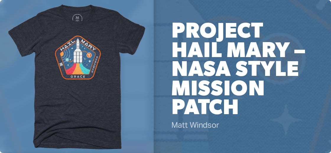
The NASA book is so interesting, full of history, facts, and great photography (I don't get any royalties by the way). It’s certainly inspired a few doodled designs in my sketchbook which one day might get worked up. It was while working on another space book years ago that inspired one of my first designs (“Rocket Science”) which Cotton Bureau featured in the T-shirt Tuesday email. I was super grateful so thanks a bunch for that!
I haven't been to Kejimkujik but it looks a special place. Truth be told I’m a fair weather camper — a tent big enough to stand up in, queen-sized airbed, etc. There’s a Korean YouTuber I watch called Ryucamp who lets me live out my cosy camping dreams and supplies cute dog/gadget/food envy.
Yeah, busy is in many ways more comfortable in my opinion, but always nice to have balance. What took you to Canada? Poutine perhaps?
I love to hear the origin stories behind designs. I get to look at all the products on Cotton Bureau and naturally have my favorites but any time I hear about where the ideas came from those designs get bumped to the top of my list. Oh, and speaking of your designs.... how did we feel about Stranger Things Season 5? Live up to expectations?
Yep, busy isn’t so bad. And freelancing was how I could move to Canada in the first place. The short version is, about ten years ago my (now) partner came over to the UK on holiday, we messaged on OKCupid, a week later I almost took her to my sister’s wedding as my plus one but then realised that was perhaps a bit crazy. So our first date was the day after (mostly in a parking lot because we got carried away chatting in the car), our second date was in New York, and our third date was in Canada. Pretty standard stuff really! Long distance dating for a year followed, then 9 months traveling together around Europe, before heading over to Canada, and then the pandemic hit. I've stayed ever since and I'm now a proud, dual-passport-wielding, honorary Canuck. And yes that was the short version. Also, poutine is chef’s kiss.
[SPOILER ALERT]
Now then, Stranger Things. First off, I think by and large they stuck the landing, on what was a ridiculously hyped up final season. That was probably the main problem — the expectations were set unrealistically high. The best bit was obviously the mid-season finale Sorcerer episode. The whole season was a bit crammed with stuff, but the final Vecna fight seemed to be over too quickly for my liking. Give us a video game style multi-phase boss fight! Also I’m glad none of the main cast died, and I found it weird that some viewers were sad no one did. What about Eddie and Bob?! (and Barb!) #toosoon. Was it a perfect nat 20? No. Could it have done with just a few extra key lines of dialogue or small tweaks to make things better. Sure. But we can all agree at least they didn’t Game of Thrones it right?!
[/END SPOILER ALERT]
Oh my gosh I love this so much. But also it really feels like the plot of a great rom-com: 3 dates, 3 countries, and a pandemic? All we need now is Matthew McConaughey and Kate Hudson to sign on and I think we have a hit on our hands.
I have to admit, I have not finished Stranger Things yet. I actually fell off at some point in season 3. After your review though I'm honestly considering picking it back up. I completely agree the expectations were set way too high then once it came out and people were disappointed and I decided to pass.
Alrighty, one last question for ya then we’ll wrap this up. Of your Cotton Bureau designs, do you have a favorite? I'm partial to Bad Decisions Make Good Stories but there are so many great choices.
Alright, alright, alright, any screenwriters please feel free to get in touch! Sometimes I find myself watching a show or a movie just to avoid spoilers. And I’ve just this second realised I may have spoiled some parts of Stranger Things for you! We can edit all this right?! Or put a disclaimer at the top. Sorry if I’ve ruined anything for you.
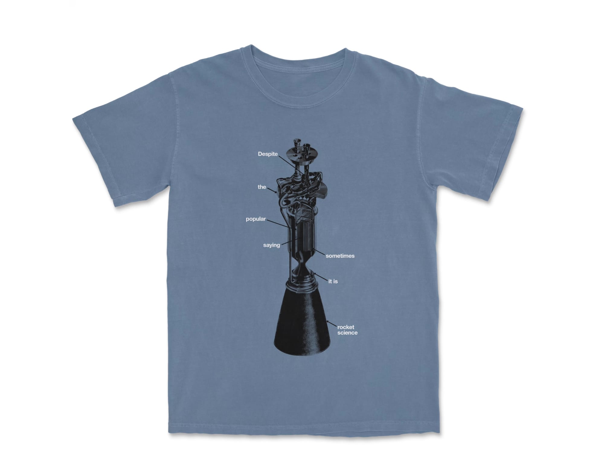
It’s hard to pick a favourite design of mine, so I’ll cop out and name three — Rocket Science, because it combines NASA and humour, Forever on a Sidequest, which combines my love of gaming and accurately describes my life, and Like Cher Subscribe, because I love puns and it just brings me joy.
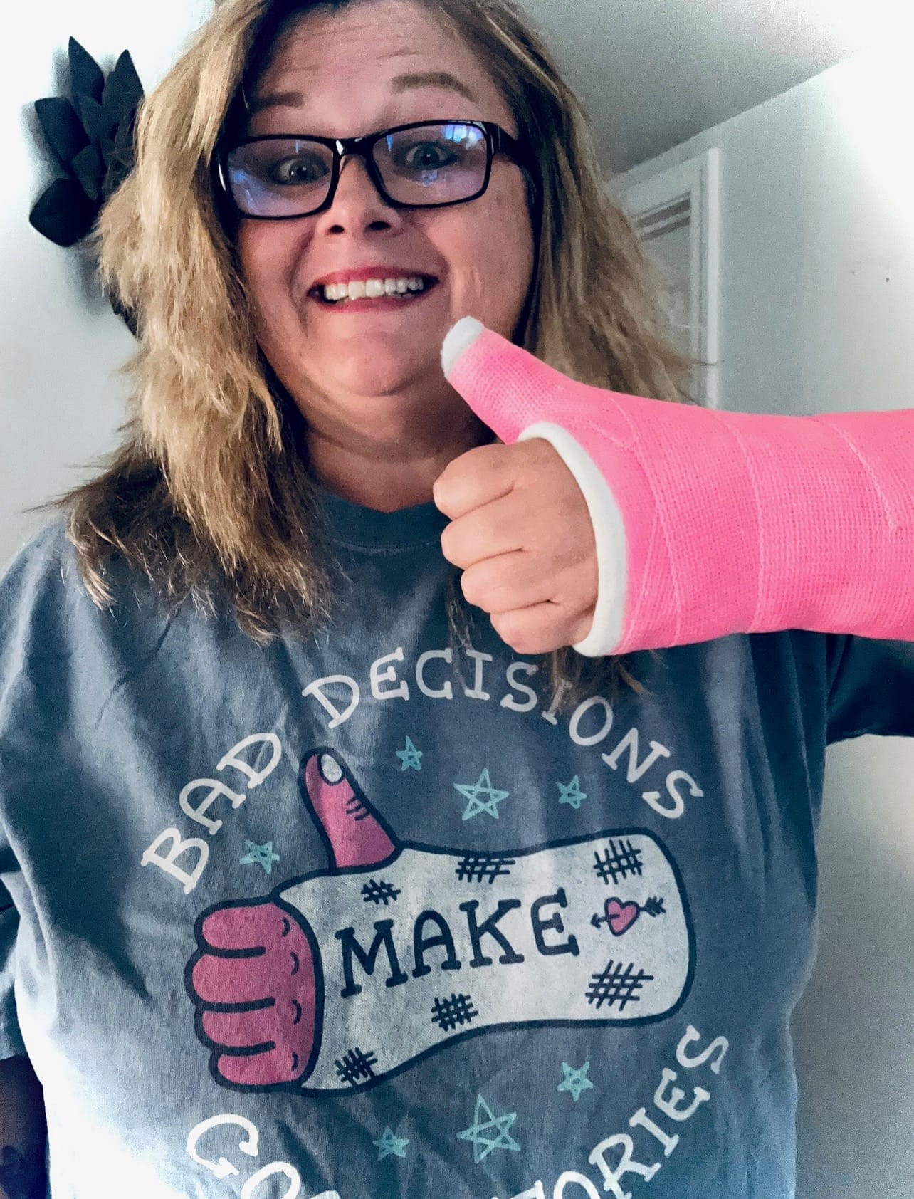
Speaking of joy and Bad Decisions Make Good Stories, a lovely CB customer got in touch with me to say she'd bought that shirt for her sister and it was perfectly appropriate. The attached photo she sent made me genuinely laugh out loud and was a highlight of last year. Because ultimately, the thought of someone liking one of my designs and wearing it, brings me such happiness. Stares off into the middle distance and removes glasses, it’s why I do what I do...
Thanks for the chat and for all the hard work, care, and attention from you and the team at Cotton Bureau!
Hahah we’ll be sure to put a spoiler alert, but as for me, nothing has been spoiled. If anything you’ve revived my interest in Stranger Things. I’m sure the Duffer Brothers will be in touch soon to thank you for the additional views.
Three choices is fair. I almost went with Like, Cher, Subscribe 😂 So good. Choosing favo[u]rites of anything is so tough. What a nice struggle to have though, eh? Having so many great options is rad.
And lastly, I love this so much. That’s so cool they reached out with a photo. I hope she’s all healed now but couldn’t agree more; Bad Decisions Make Good Stories [and the best photos].
Take care, Matt! Can’t wait to see where life takes you next.
When you’re born in the 1980s in Pittsburgh, your grandfather was probably a steelworker or a farmer. Maybe you had one of each. Either way, the idea was the same. You wake up, early, and you put your time in. The work goes in one side, the product comes out the other. Day after day, week after week, year after year.
Cotton Bureau is the direct result — and, we hope, an ongoing legacy — of that ethos. Show up. Work hard. Do it again.
So it is with pride that we recognize the anniversary of the day we launched 13 long years ago and our Steel City heritage.
As part of the celebration, we’re offering two incredible deals.
FIRST, get our annual birthday t-shirt design, available in Basic ($13) and Deluxe ($20).
SECOND, select an on demand tee of your choice, again for an unfathomably low $13.
PLUS, get 10% off all additional on demand products. Use code LUCKY13 at checkout.
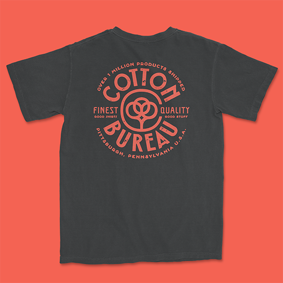
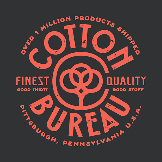
This year’s birthday tee is designed by local friend and artist Daniel Gurwin.
Both designs are screen-printed with water-based inks to last forever and feel great and are available one week only for the low, low price of $13.
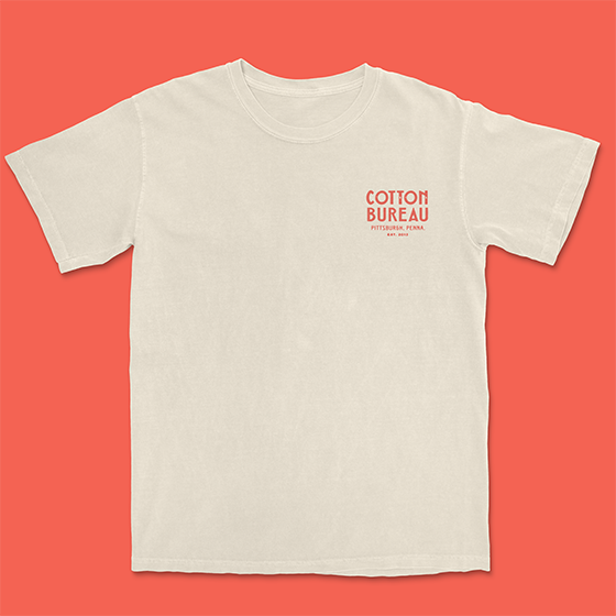
The basic tee features a simple, 3" wide pocket print with our name, location, and date of establishment. Available in your choice of white, natural, light grey, and charcoal styles.
It’s the perfect way to show your support for Cotton Bureau without inviting any questions not already answered by your shirt.
The Deluxe version adds a large back print which showcases a Cotton Bureau seal plus a discreet woven hem tag on the front. Slightly more expensive at $20 but still a bargain.
Perfect for the true believer who wants, nay needs, friends and family alike to know where the finest quality apparel may be found.
Don’t forget by using code LUCKY13 at checkout, all Cotton Bureau customers are entitled to one on demand tee (or tank top for maximum summer vibes) of your choosing — again for the thematically requisite low, low price of $13.
Our entire on demand catalog is eligible as part of this promotion. Deal ends in one week on Friday, June 19.
At our normal retail price of $32, we don’t even want to calculate the percentage discount we’re talking about. (The Finance Department would shut this deal down immediately if they knew.)
FINALLY, as a further thank you for your long-standing support, we’re discounting all additional on demand products by 10%, so load up that cart with as many shirts as you can fit. There’s no limit to how much you can save.
Just make sure you use the code LUCKY13 at checkout.
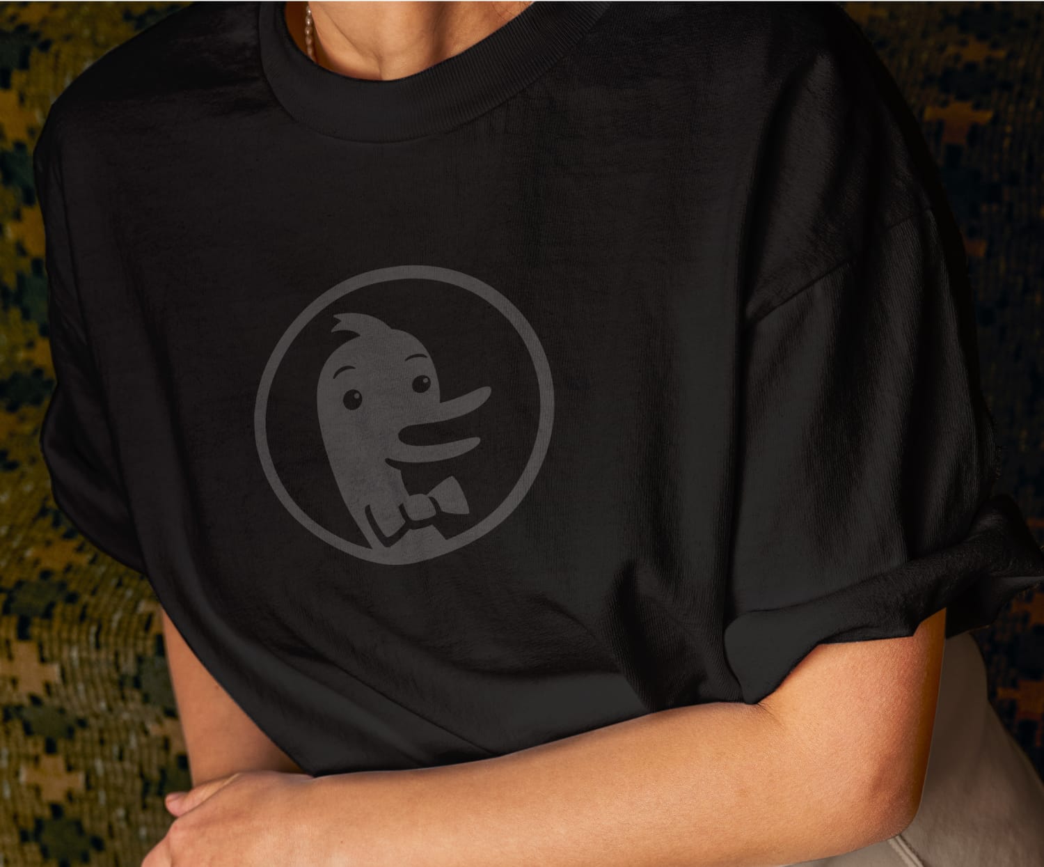
Last year our friends at DuckDuckGo approached us about teaming up to offer a line of t-shirts and other merch. Earlier this week the first round of items dropped including the Dark Mode tee featuring erstwhile DuckDuckGo mascot Dax in striking black-on-black.
To kick off our new partnership, we hallucinated an entire interview with Duck.ai which we are presenting below. Just kidding, we fired off a few questions via email to learn more about why they chose to work with Cotton Bureau and what might be next.
Hello! Thanks for taking a few minutes to chat about the recent DuckDuckGo / Cotton Bureau collaboration. As privacy-valuing users and paying subscribers to Duck.ai (thank you for adding device sync, btw), we’re big fans of what you all have been doing lately. Add to that our long-standing admiration for your principled approach to running a business, and we can honestly say it’s a privilege for us to finally be teaming up on this new line of shirts and other merch.
Would you mind telling us a little bit about this collaboration?
Thank you, that's very kind. At DuckDuckGo, our mission has always been to raise the standard of trust online, helping people protect their privacy across browsing, search, email, and AI. This collaboration is an extension of that mission into the physical world. We partnered with Cotton Bureau because you share our values: care, quality, and respect for the people who use their products.
Well, shucks, thank you. We couldn’t agree more, and it’s gratifying to see the effort we have put in over the last decade plus translate into opportunities like this.
So, why does a search engine / private browser / AI chat anonymizer want to sell t-shirts and other things? Surely you have your hands full already.
Millions of people have made the choice to use DuckDuckGo every day, and we wanted to give them a way to wear that choice proudly and with quality. It's a fun way to celebrate the people who have championed DuckDuckGo over the years. A shirt becomes an everyday signal that privacy matters and that there's a community of people who believe the same. We've always thought privacy is something worth wearing on your sleeve, so we figured we'd make that literal.
Well said. But, be honest, was this all Dax's idea? It’s at least a little bit loony.
As you can imagine, Dax is extremely private. So private, in fact, that not much is known about him. Even we struggle to keep up. But we've heard through the duckweb he's very excited about this collaboration. Let's just say he may or may not be the de facto creative director around here (among many other roles he prefers to keep under the radar).
Will there be more product collaborations in the future? We understand Dax is notoriously private, but surely he can give us a hint or may be a portentous nod.
There is no need to be private about supporting privacy. We look forward to more collabs in the future!
In addition to maintaining a shadowy persona, we know Dax and the rest of the team are busy, so we’ll try to wrap this up quickly. DuckDuckGo is famous for protecting users’ privacy. Does donning the Dark Mode tee offer similar protection in real life? Would one be immune from, say, identity thieves and malicious snoopers with long-range microphones like they use in the movies to listen to your conversations?
You’ll have to download our app for that! Which you should absolutely do.
Done! While we’re a little bit disappointed the t-shirt doesn’t come with superpowers, we knew it was a long shot. We’ll let you go now so Dax can get back to his life of fighting crime optimizing search and keeping you safe online. Thank you so much for your time!
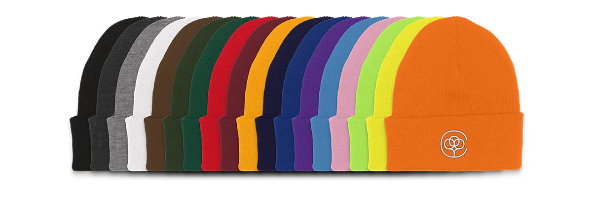
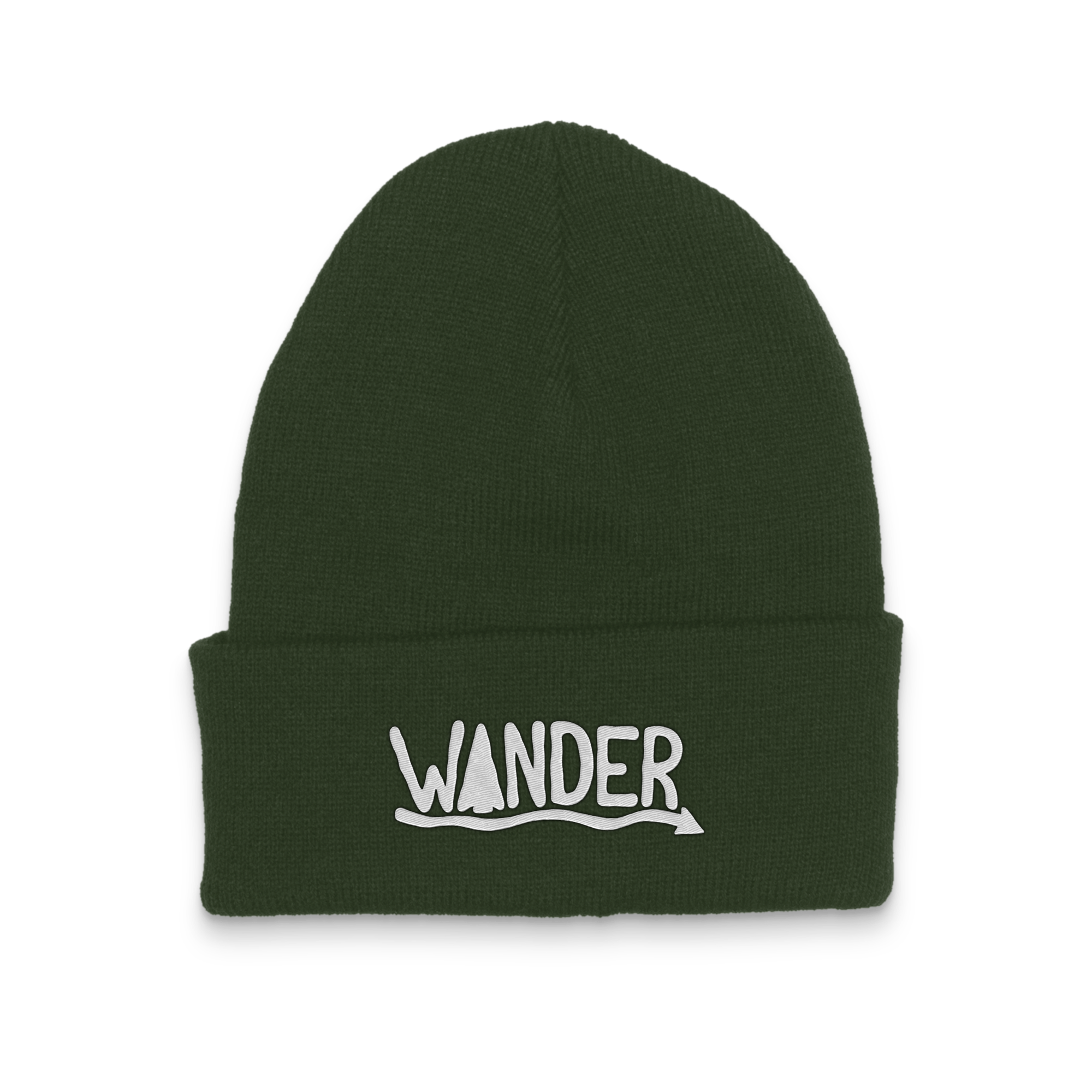
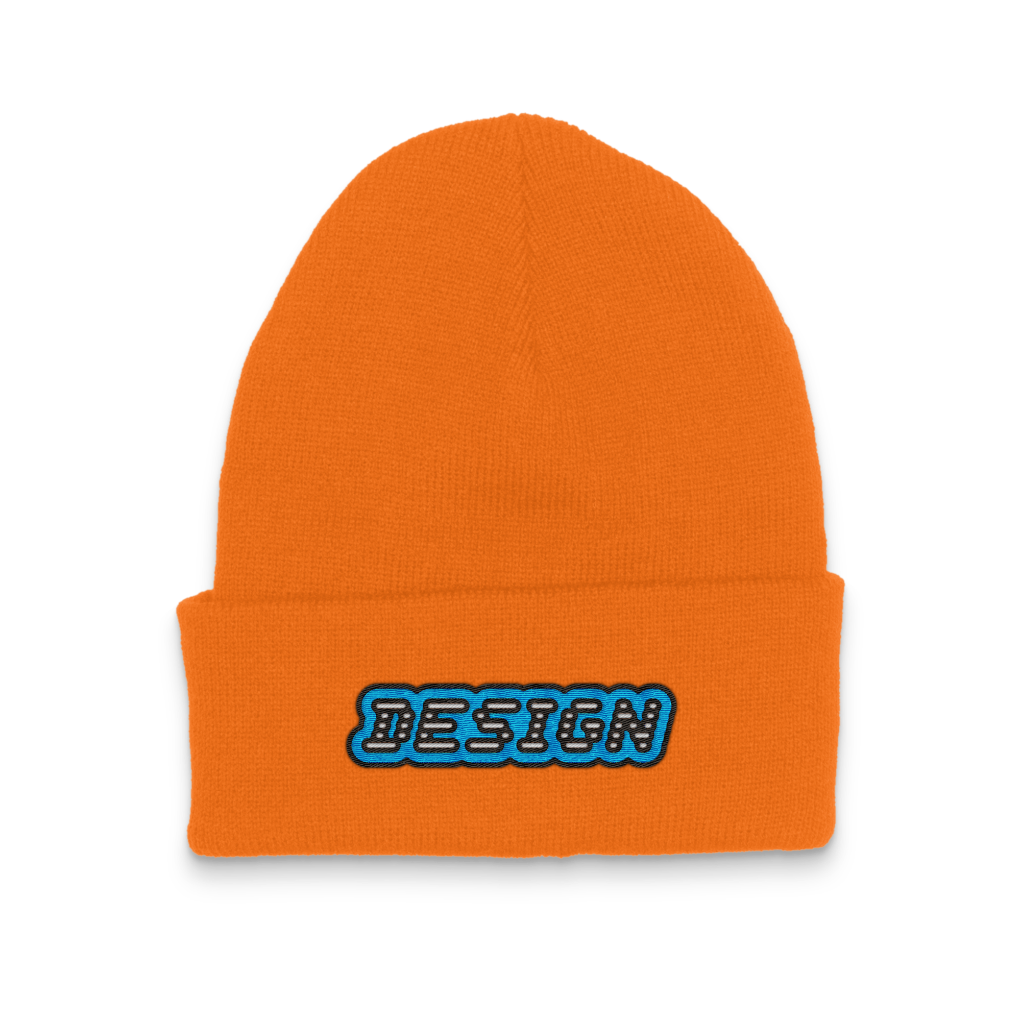
Available in 18 delicious colors to keep your ears warm, our beanies are 100% hypoallergenic acrylic and constructed from an extra dense knit, ideal for embroidered applications. One size fits all, but expect it to feel snug if your head is on the larger side.
The full color lineup includes black, dark grey, heather grey, white, brown, neon / blaze orange, gold, neon / safety yellow, pink, maroon, red, purple, royal, navy, turquoise, safety / neon green, forest, and olive.
As with hats and shirts, please keep our embroidery guidelines in mind. Thread colors are limited to our standard palette. Max size is 3.75" wide by 2.25" tall. Stay away from small details that may be difficult to execute. If you have any questions, ask us. We’re happy to help.