
Feature Friday #030 — Mark Caneso
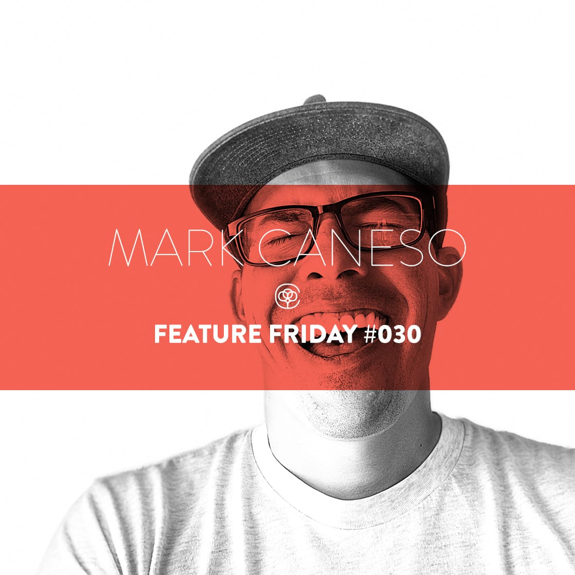
Where in the world is Mark Caneso? Catching up with the prolific artist and type designer as he settles in after his most recent relocation.
P.S. Get 20% off everything in Mark’s Cotton Bureau store now through Sunday, November 30 with coupon code featurefriday20 at checkout.
Mark! Let’s do this. It’s always fun to talk to someone who was there at the beginning of Cotton Bureau. The first design you sent us was a collaboration with Cycle Cause. Everything was so simple back then. Two week campaigns. One shirt color.
Twelve years later your embroidered No Space for Hate design is available all the time and comes on 65 different colors and styles — and that’s us trying to avoid overwhelming people with choice!
Have you seen a similar increase in complexity in your life and design practice, or have you been able to hold the line?
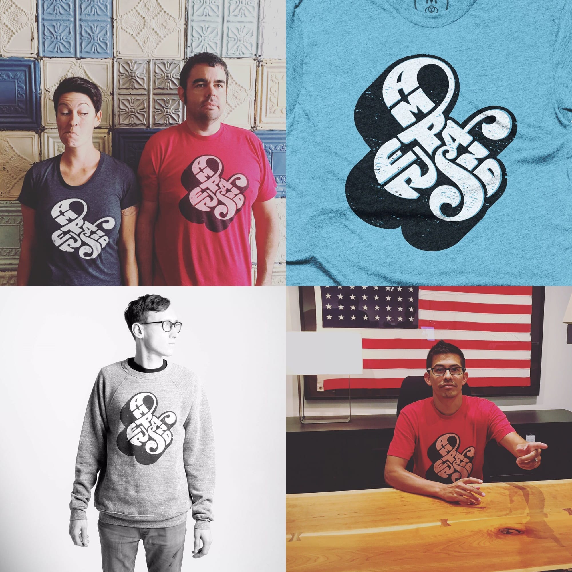
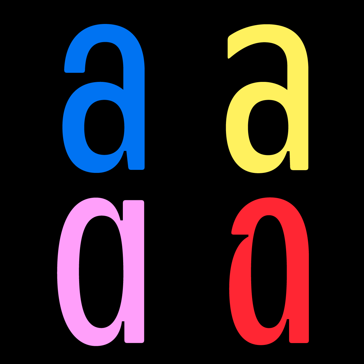
Hey. Thanks. The Cycle Cause tee was back in 2014. I believe the first design I sent you was in 2012ish. The Self-Referential Ampersand. But yeah, those two-week campaigns feel like forever ago.
I think life has gotten more complex for sure. But my wife and I hit reset every couple years and move to a new state. Moving can make things equal parts hectic and new. Design-wise I've simplified my practice. Now I have a more dedicated focus to my type foundry: pstypelab.com.
Shoot. I should have checked the archive more carefully. In any case, that’s a classic and one of our favorites.
Tell me more about the regular resets. I love to travel, but I find I can barely tolerate migrating to a new iPhone each year much less moving to a new state. Where have you been? Where are you going next? Which location was your favorite?
Yeah, So it all started a little over a decade ago now. My wife and I are both originally from Southern California. We thought, what would happen if instead of visiting a place on a short trip and trying to jam in all the “things to do.” What if we picked places and moved for a longer period of time. That would allow us to explore the area at a different pace. Live like the locals and get a better sense of the cities themselves.
Our first move was to Oahu, Hawaii. At that time, we didn’t have a specific timeframe for how long we'd be there. It ended up being about 2 years. Then we popped back to the mainland — to Portland. Oregon, followed a few years later by Austin, Texas.
In 2020, a month before the pandemic, we moved to Charleston, South Carolina. We were there for 3 years. We headed south from there, down to Orlando, Florida for 2 years, and just this year we transitioned all the way back to Oahu, Hawaii. We’ve been here since February, so no plans for what is next. I personally don’t like to pick favorites. That is a question everyone asks, but we love various things about each city/location. I think what I enjoy most is when returning to these cities, they feel like home again. I have built a mental map of how to get around, so that is kinda cool.

That’s quite a timezone and culture tour. Have you considered any places outside the US? And what made you decide to go back to Oahu instead of one of the other islands?
Yeah, in 2017 when we were in Portland we took a trip to Australia for 6 weeks. We considered moving there, but at the time logistics of it all seemed a bit much.
We did consider other islands. Maui was originally the spot, but after the fires we didn’t feel like we should be taking up housing for folks who needed it. We know a few people who were affected, and it just didn't sit right with us at the time. We also visited the Big Island but ended up coming back to Oahu.
Gotcha. We got to visit Maui and Big Island a few years ago. They were both incredible.
I have to say, I didn’t realize how large your catalog of custom fonts is now that it’s your main focus. It must be so cool to see your work out in the world being used by brands like Yellowstone and Pixar. Is that something you can talk about?
Yeah, my library of retail fonts is hundreds of fonts across approx 30 type families.
I've been at it for a bit now. I released my first font back in 2008-09. For the longest time I considered my type design as a bit of a side project. I suppose I was in a bit of Type Design denial. Not sure why but I assumed I'd always be a graphic designer who also made fonts.
Now, fast forward to today, the only “graphic design” work I do is for myself or my foundry. I take on custom lettering projects if they interest me, but I definitely have a foundry first mindset.
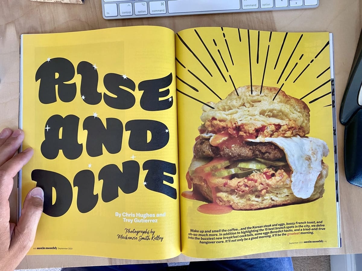
Seeing my fonts being used out in the real world is the best. Always brings a smile to my face to see how others take something I made and put it to use for their projects. So often they are used in ways I hadn’t imagined. The usages range wildly from things like dog food to international music festivals.
With my library being on Adobe Fonts, I often don’t know who is using them or for what, as with the case for Yellowstone and Pixar. I remember watching TV and seeing a commercial for Yellowstone when it originally came out. I was so stoked, pointing at the television telling my wife “That's Hatch!” Most of the time I catch a glimpse while scrolling on social media or maybe someone shares a sighting with me. I've been collecting them and building a collection I call “Typespotting 👀”.
I have some folks who share sightings with me often. One of my favorite things is when I just stumble upon them myself. This happened recently when we were travelling in Japan. We were being tourists and visiting the Tokyo Tower. We walked into the open-air stairs and spray painted on the wall was my typeface “Neighbor Stencil”. Not like it’s some fantastic use of the font, but it’s still a nice surprise to me when I see them. I didn’t see this in person, but Hoss was used in a Hello Kitty rebrand of the Oita Airport for the World Expo this year.
Walking around the grocery stores is a fun place to spot the fonts. I’ve seen them on everything from beer can design to packaging for pork lard. Trader-Joe’s has a few products they offer that use my fonts. These wafer cookies and protein pancakes both use Decoy. Anyway, you get the point. I get excited when I see them used. So if anyone sees them in the wild please feel free to share them with me.


That’s awesome. I know the feeling for sure. We’ve seen hundreds of people weaering t-shirts we have designed or sold over the years. Always brightens your day.
I imagine you can’t narrow down your library to a single favorite font, so let me ask a different question. Of all the type families you have created, which one has the most interesting origin story?
I was working in my type lab late one night and all of the sudden I was bitten by a radioactive spider.... Sorry that's a different origin story.
Actually it’s funny that you used the words “origin story.” I recently commented to another designer about this topic in regard to my latest typeface “Please”.
I wrote:
Not every typeface has a dramatic origin story. Sometimes a single letter is enough to get the ball rolling. A sketch turns into an idea that develops into a moment when I think to myself, “yeah, that could be something.” Please started this way. While experimenting with extremely heavy weights, I noticed the double-story started to close up — its counters filling in as the weight increases. To solve this issue you typically end up compensating somewhere or everywhere. It's just the nature of the double-story form. But I thought: what if I merge them? Or really, remove one of the counters. Would it still read? Would it still be an ‘a’? Did it matter if it looked cool?
That single-counter version became the pulse of Please.


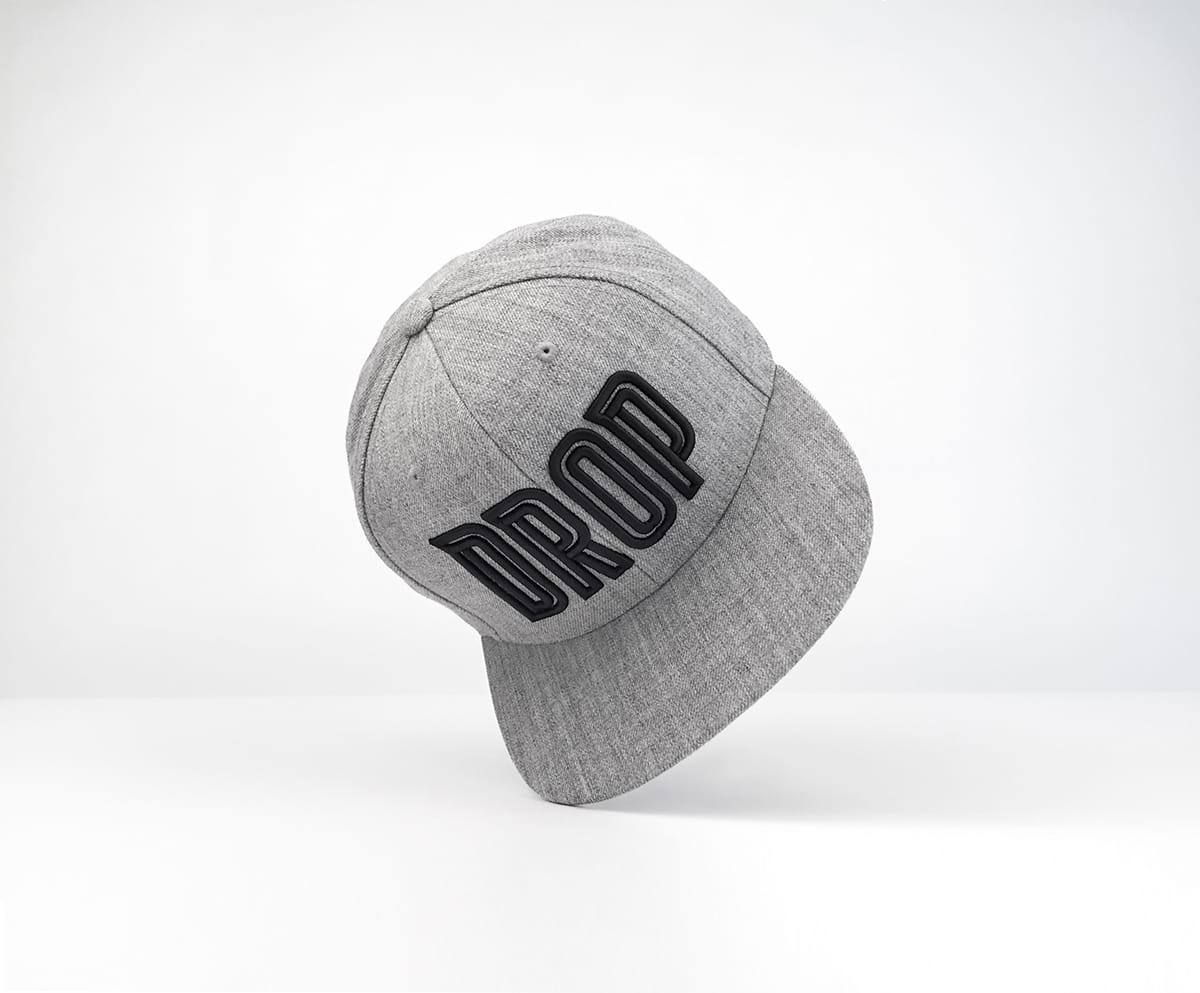
But actually, one of my typefaces that did start out in an interesting way was “Ditch”. This wasn’t originally a typeface at all. It was just 4 letters I made for my Drop Cap. Back in 2017, I had the idea to make some type merch. A hat with just the word DROP on it. I wanted to have the decoration on the hat be 3D embroidered. In order to make it as bold as possible — and for the letterforms to have as much depth as possible — I created an inline version of the lettering. This subtle opening allowed the art to perform better when stitched. After producing the hat I figured I’d see what the rest of the design could look like, so I flushed out the rest of the glyphs.
I love the concept of Please. It may not be the most immediately legible typeface in its heaviest weights, but it’s distinctive and certainly has a place under the right circumstances. (Also, the Andchovies tin… chef’s kiss.)
Sorry to jump around, but I was just thinking back to your itinerancy. Knowing that you will likely relocate every few years, how do you make each place feel like home while you are there?
I have to say I was pretty pleased with myself when I came up with Andchovies.
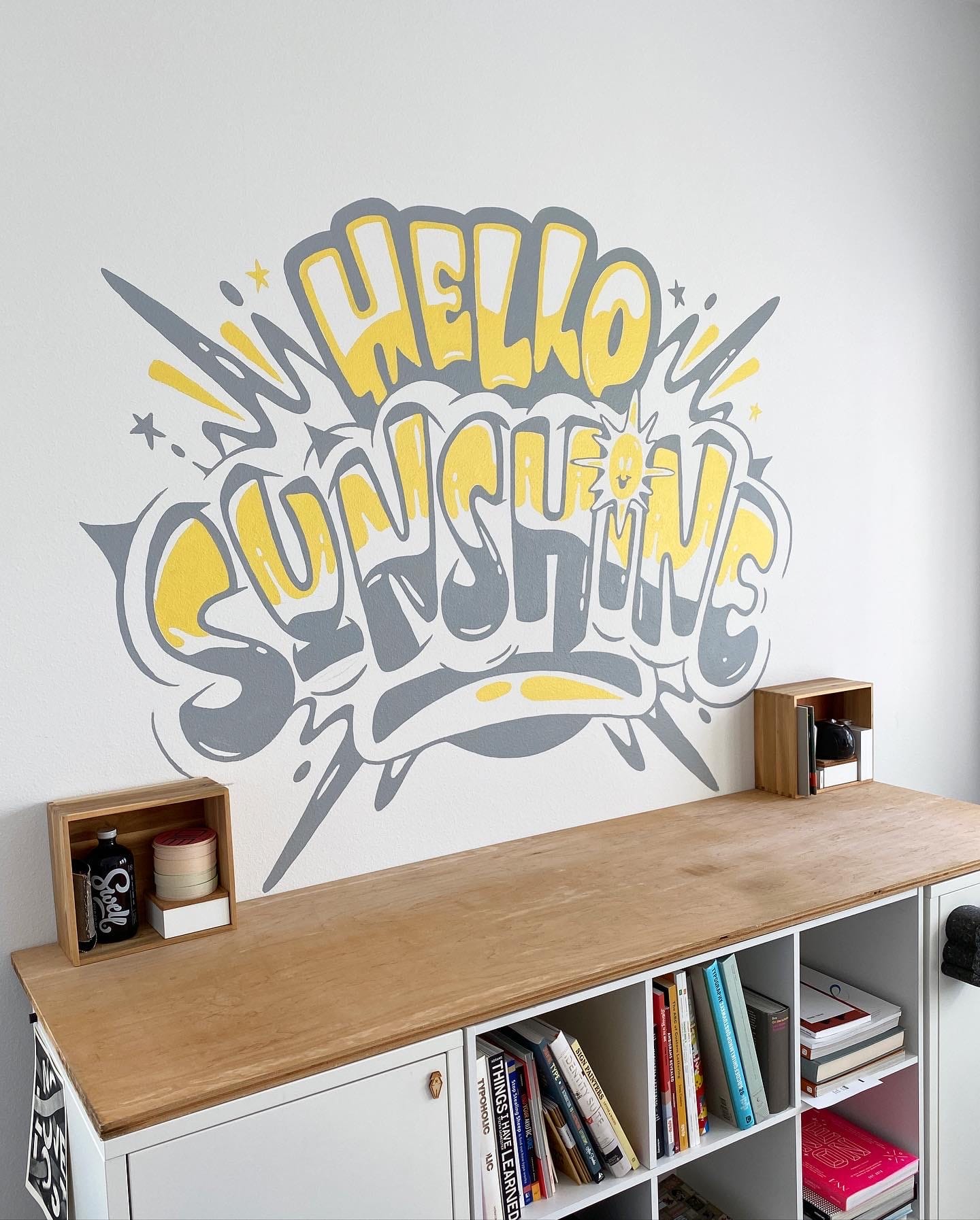
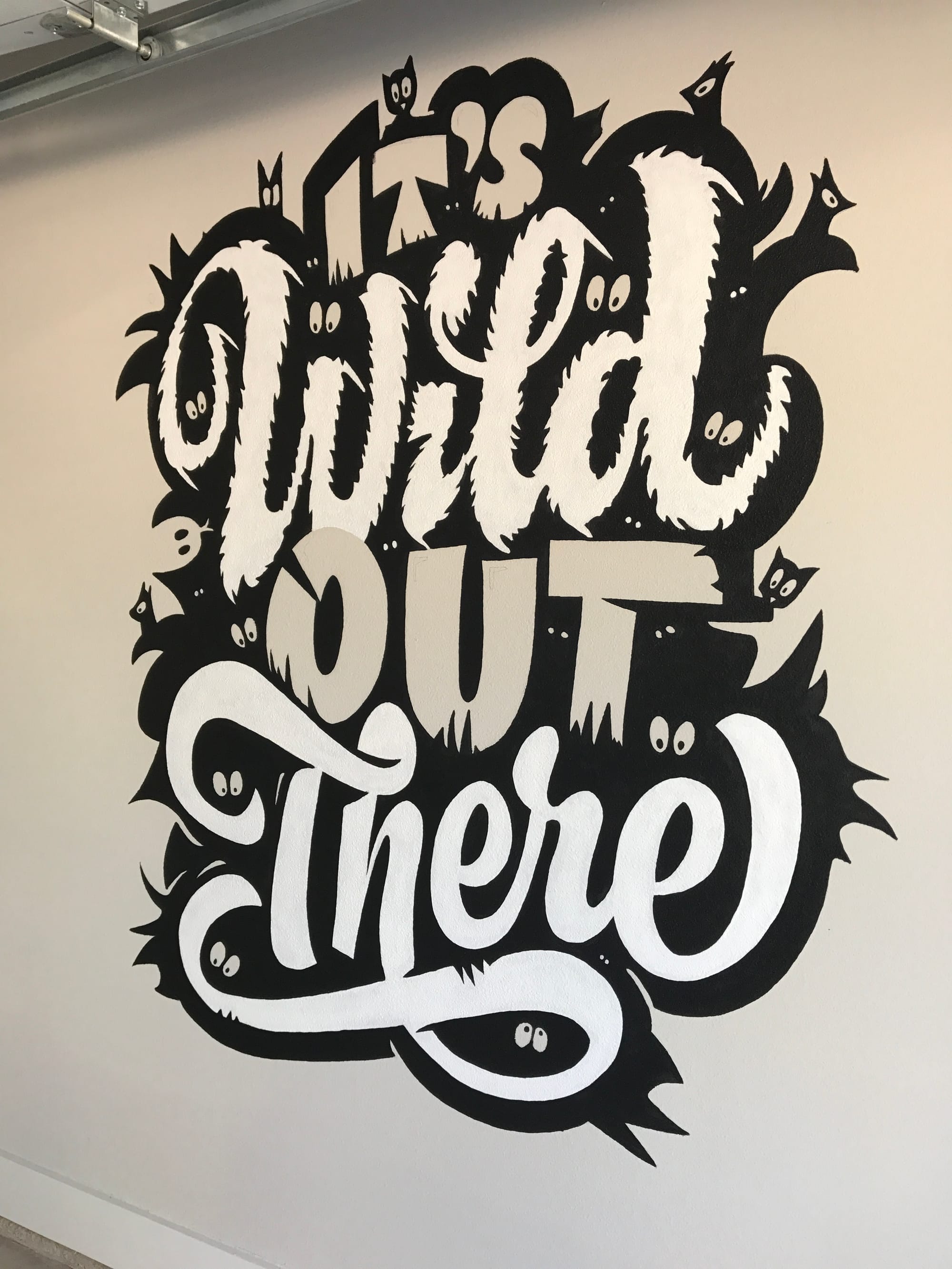
Making each place feel like home doesn't take much. Just a little paint will usually do the trick. I like to create a custom mural or art piece somewhere in each place — usually my office, but I've also painted few in our garages. It’s a nice ephemeral exercise because I know at some point I will have to paint over it. It keeps me from being too attached or precious with the design. I just make it and move on.

So, to change topics completely, I need to ask you about what I think is easily the most interesting and impactful event since the advent of the iPhone… how are you feeling about AI?
I'm no Prompt Jockey if that's what you're asking. I guess I'm still forming my opinion about it all, weighing the pros and cons. I mean, I use ChatGPT on occasion for copy editing, and I've tinkered with FireFly to make some random images. I haven't used it enough to change the way I work. I'm sure there are people who have strong opinions one way or another. I'm definitely not in the “AI will ruin the world” category. If you’re trying to make things more efficient or tackle repetitive work, I get that.
Back in 2009-10, my father-in-law offered to help my wife and I remodel the bathroom in our condo. We tore out the tub and everything down to the studs to install a walk in shower. I have no knowledge of this kind of work, and I’m not the handiest person. But he ran his own handyman business for years, so we trusted his methods. We ended up making the upgrade with a method similar to lath and plaster, attaching wire to the studs and covering this 8' x 10' wall with so much concrete. I was hauling 60lb bags of concrete up stairs and mixing it all batch by batch with a hand drill mixer. It was dirty and super labor intensive. We were at this for what felt like days. And we had to babysit it the whole time. Keeping the concrete wet so it didn’t crack. It was so much work. This was all just to get a new wall to tile on top of. When the walls were done and we were admiring our level smooth new wall he said, “You know, they have these moisture-resistant drywall boards now. They’re supposed to make this cheaper and quicker to install. Without hesitation I said “Why the hell didn’t we just use those?”
How does this relate to your question… Maybe it doesn’t. I feel like as things change you can either embrace them or continue to do things the way you know how. The new ways may be a little scary because they are unfamiliar or unknown. Yet, the old ways may end up taking you way longer, costing you more time and energy. I know our wall will be there even if that building burns down. It’s gonna last. It was made well and we took our time. There was craft involved and that feels good. But at the same time, that level of craft wasn’t really necessary. Nobody will ever know what is behind that tile. If I could have typed “make me a wall” and hit generate, I would have done it in a heartbeat. For now, I’ll keep making things the way I know how to, but I’ll keep tinkering for sure.
Well said. Having just spent the summer and most of the fall building a deck, I certainly learned the value of different approaches and choosing the right tools and materials for the job. Still, it’s hard for me personally — even as someone who isn’t a designer — to be okay with the way that someone else’s work is copied, compressed, and regurgitated by a computer as if it’s equivalent to an original piece created by an artist. After all, I don’t outsource my writing to a mindless agent that has been trained on my past effort, no matter how much “easier” it would make my life. It’s what I do.
I suppose this is how people felt when mass production methods were introduced. I do have hope that for both consumers and patrons, knowing the source of the artwork (i.e. the person who is making it) still carries enough weight to allow those with real talent to continue to make things.
I think this is a great way to send us off to the holiday maelstrom, to be honest — spending time (hopefully) with friends and family (something we can’t ever outsource), coming back recharged and ready to tackle new problems with whatever tools and techniques are necessary.